TOPICS
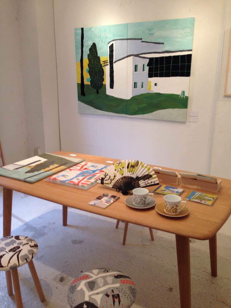
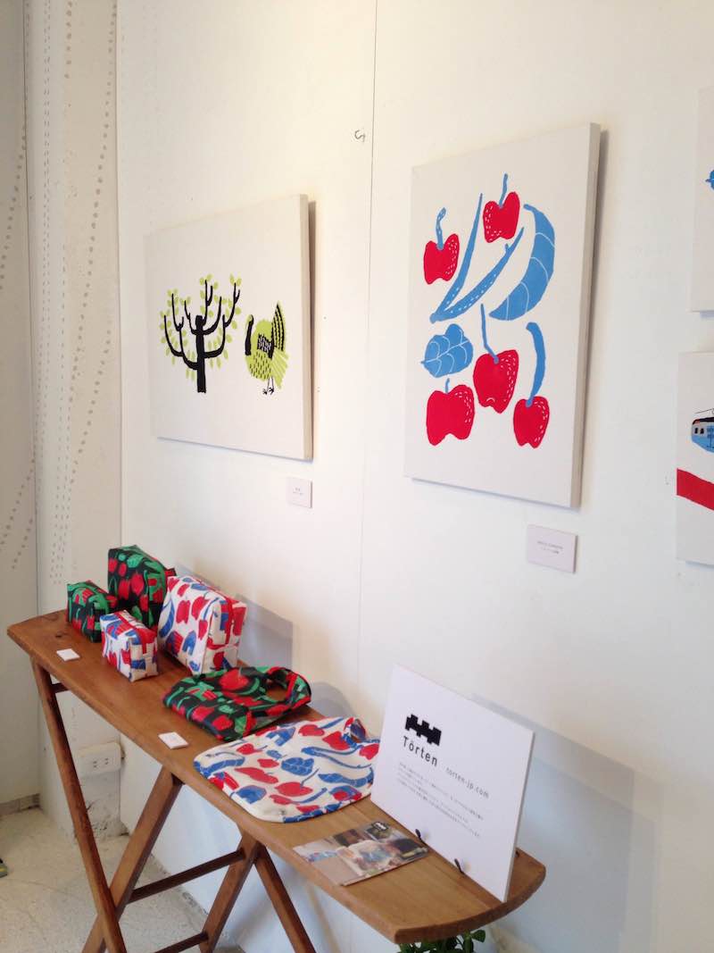
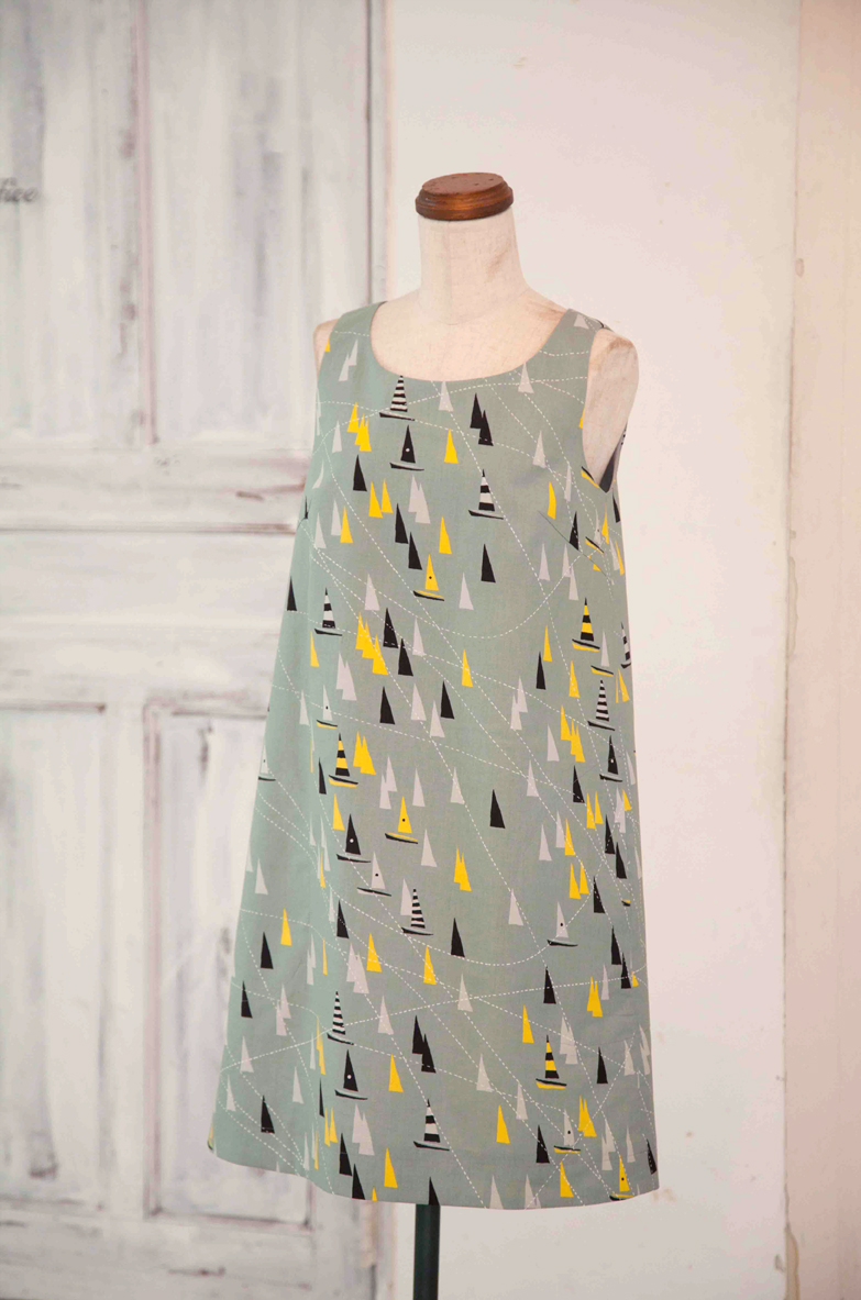
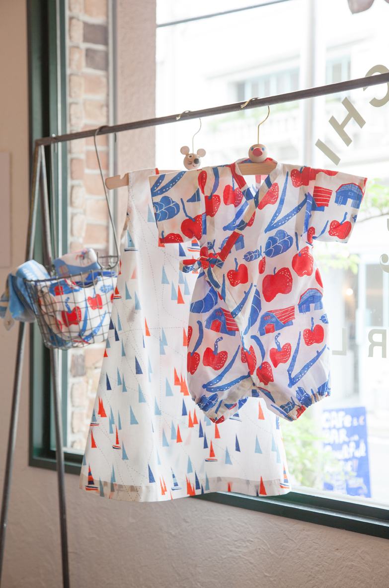
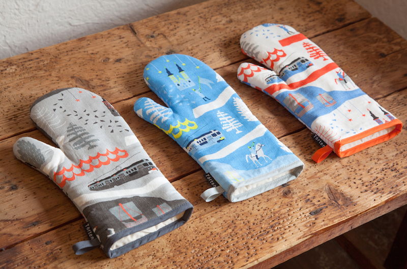
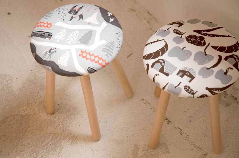
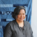
In 2013, the Third Kokka Print Textile Competition “Inspiration” was held, and Natsuki Camino splendidly won the grand prize out of 163 entries. Recently Camino’s beautiful textile line named “Törten” made its debut, which prints are from her illustrations including the winning artwork of the competition In addition, she designed a cup and saucer bridal gift set for Barneys New York in 2012. She continues to be active by contributing her work to fashion magazines and advertisements.
I had always dreamed to become an independent artist painter while engaging in a design-related job. Painting was what I liked to do most at that time. Contemplating how to create a business out of what I liked, I wondered if painters would be in demand for book-cover design, illustration in magazine and so on. After that, I started to visit publishers to promote my works as well as held my personal exhibitions occasionally.
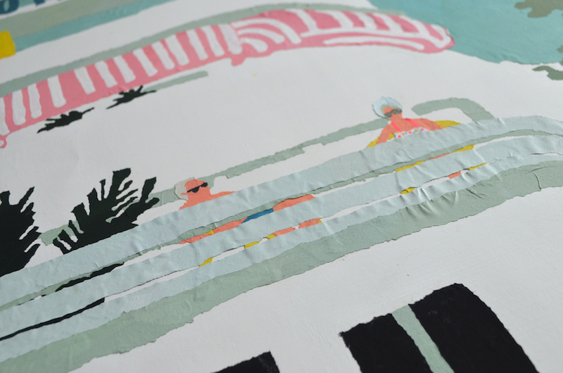
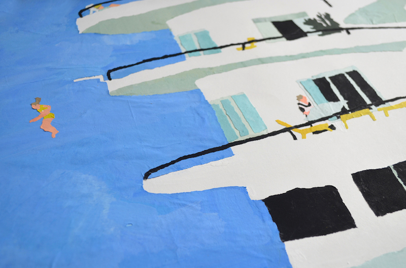
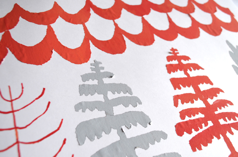
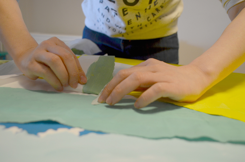
It is the result of much trial and error. In the beginning, I had looked at every possible way to create my own style. I tried pen drawing, too. Then finally I found “Chigiri-e” that is collage art made of torn papers. The method was perfect for me to create what I wanted to depict and also fitted my skill. Tearing paper by hand, each piece cannot always be shaped as intended. That’s rather interesting and what I like really like about “Chigiri-e” method. Most of my early works were landscapes in size of B1 (1030mm x 728mm, or 40.55in x 28.66in) with pieces of largely torn papers. Amid growing demand for smaller-sized artworks, my creations have become more diverse with a variety of motifs.
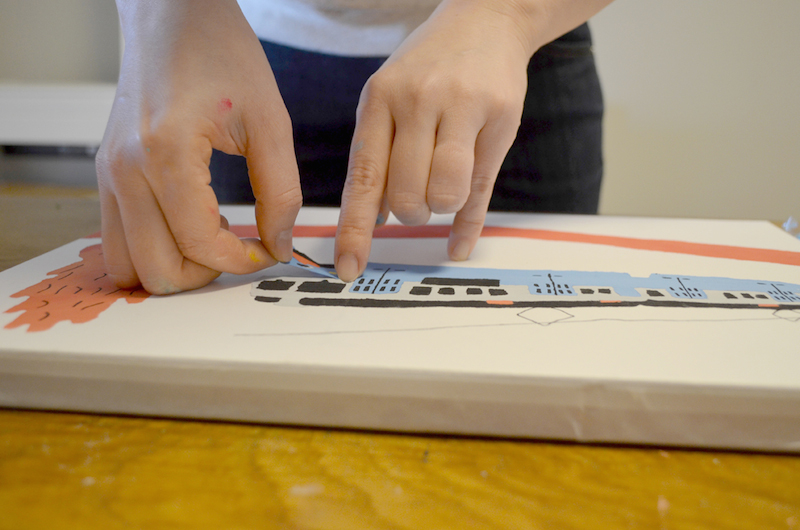
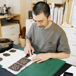
First I dye papers according to my idea for coloration that will be essential for the creation. When assorted colored papers are ready, the next step is tearing each paper by hand. Paste each torn piece to create image that may resemble a painting. I use a regular liquid glue to paste torn papers.
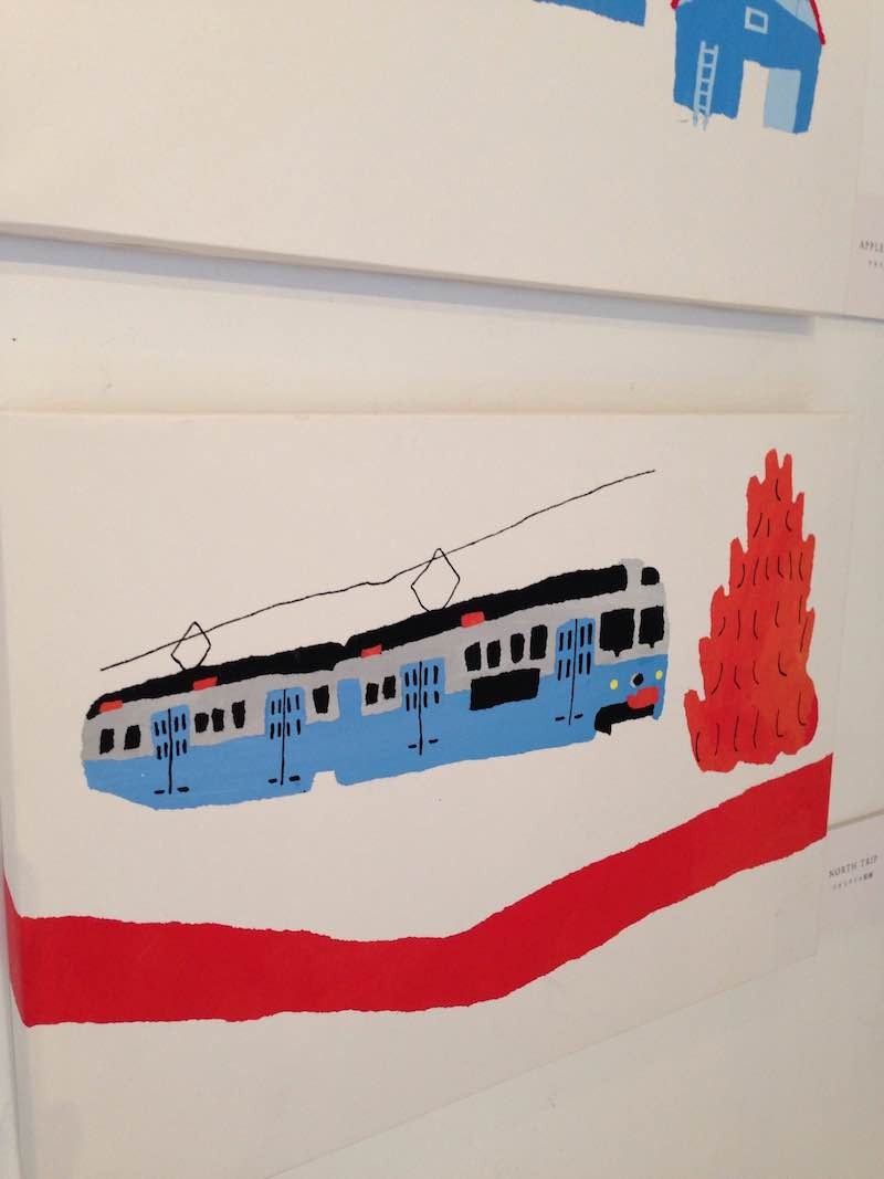
Buildings, infrastructures, trains…. Those are what I usually draw. You may laugh, but I am almost “Danchi-moe” or a fanatic of old public apartments for their retro style. I like concrete blocks, too. I actually stock a lot of pictures of these items.
A fabric printed with my artwork – that sounded thrilling for me. In fact, it was my dream.
Some of your illustrations including the winning artwork titled “Apple Garden” have turned into fabrics and are in the market with your textile brand “Törten”. Was there any difference to work on between regular illustration work and textile design?
The notion about colors is greatly different, I think. For the illustration, the colors I use can directly be a part of my artwork. On the other hand, multiple color combinations are required for one fabric. I also realized that dim colors, which I am usually fond of using for my illustration, would be too low-key or blur on fabric.
The hardest work for me was to design layout so that each image could have been properly registered. To print repeating patterns seamlessly, I needed to be very careful about the “joint” which is the point of repeat on the fabric. A faulty joint would cause uneven repeating patterns, and the fabric would become B-graded. I adjusted the position of joint over and over again for “North Trip” that is the fabric with large-scale patterns in “Törten” brand.
(KF): After such a thoroughgoing effort and preparation, the beautiful textile line “Törten” finally made its debut! It is so great that we can enjoy the world of “Chigiri-e” shown on fabric. Clothes or a bag made with the fabric will bring us closer to Ms. Camino’s artistic sensibility.
(KF) The launching of “Törten” was exciting news for us. Can’t wait for the second series from the brand!

